Mock Interview Application revamp(Phase 2)
I redesigned VMock Interviews from a basic Mock Interview experience into a guided, personalized, and scalable platform.
Role
Senior UI/UX Designer
Timeline
2 months
Platform
Web & Mobile
Business model
B2B2C
Users
Students, Recent graduates, Professionals
Team
1 Designer, 1 APM, 5 Engineers(Frontend, Backend, Data Scientist)
Scope
Redesign + new feature expansion
Status
Shipped
Context
Select mock inteview
Choose relevant questions
Setup screen - Face calibration
Record responses
Receive feedback
Re-attempt
VMock Interviews had two core experiences: Elevator Pitch and Mock Interview.
The experience was not driving enough engagement, confidence, or repeat usage.
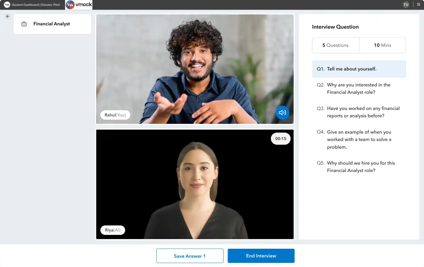
VMock Interview Application - Old Design
Clients and users found the experience difficult
Clients and users reported friction in the experience, and adoption remained limited.
Users practiced once but did not come back
Users completed interviews, but did not re-attempt after feedback.
Only two interview types were supported
The product only supported Elevator Pitch and Mock Interview.
Not mobile responsive
The old Interviews experience was not optimized for mobile devices.
Based on research and product discovery, I redesigned VMock Interviews into a more guided, contextual, and scalable interview preparation platform.

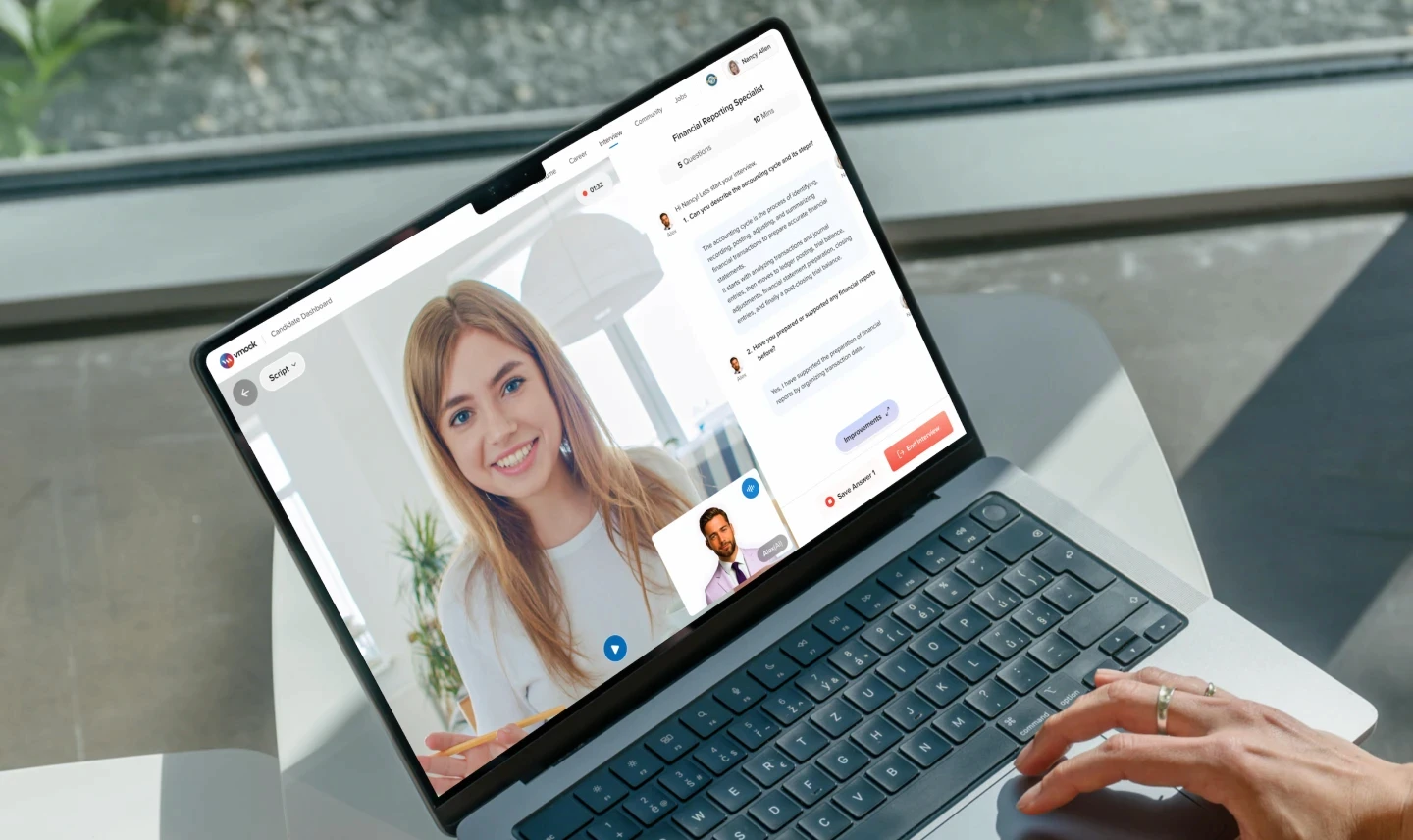
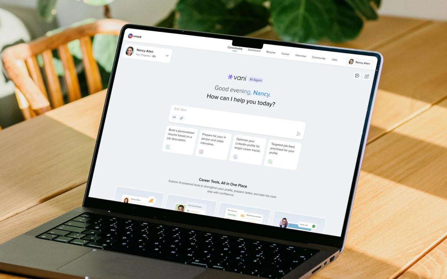
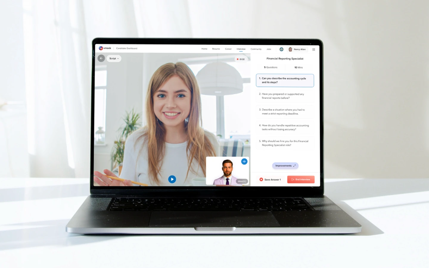
VMock Interview Application - New Design
Added more interview types for different needs
Users could practice through generated, custom, requested, community, company, and assessment-based interviews.
AI Script - Helped users prepare answers before recording
Users could generate AI scripts for each question before starting practice.
Made the platform work on mobile too
Redesigned the Interviews platform to work smoothly across desktop and mobile devices.
65+
New business schools adopted
4.5
CSAT Score
+74%
Engagement with detailed feedback
29% → 85%
First Attempt Calibration success
90%
increase in re-attempt behavior.
Metrics represent post-redesign product signals across adoption, engagement, setup success.
End-to-End Product Design Ownership
I led the redesign of VMock Interviews from research synthesis to high-fidelity design, helping reframe it into a guided, personalized, and scalable interview preparation platform.
Product Strategy Input
Translated research, client feedback, and product data into a clearer design direction.
Research & Audit
Conducted usability testing, heuristic evaluation, competitor benchmarking, and design audit.
Information Architecture & User Flows
Restructured navigation and mapped journeys across discovery, recording, feedback, and reattempt.
High-Fidelity Design
Designed core screens across dashboard, setup, recording, feedback, and new interview workflows.
Users
I defined the key user personas to understand their goals, pain points, and expectations across the interview preparation journey.

Primary
Students
Goals & Needs
Guidance before and during recording
Simple feedback on what to improve
Confidence before real interviews
Design Implication:
Make the experience guided, supportive, and easy to start.

Primary
Job Seekers / Early Professionals
Goals & Needs
Role-specific and company-specific practice
Feedback on answer quality, delivery
Questions relevant to resume or JD
Design Implication:
Support personalized practice and clearer reattempt paths.

Secondary
Career Coaches / Universities
Goals & Needs
Visibility into student progress
Easy ways to assign interview practice
Measurable improvement outcomes
Design Implication:
Enable community-led practice with progress visibility.
User Journey Map
(Existing Mock Interview Experience)
I mapped the full journey from discovery to reattempt to understand where users were getting confused, losing confidence, or dropping off during interview practice.
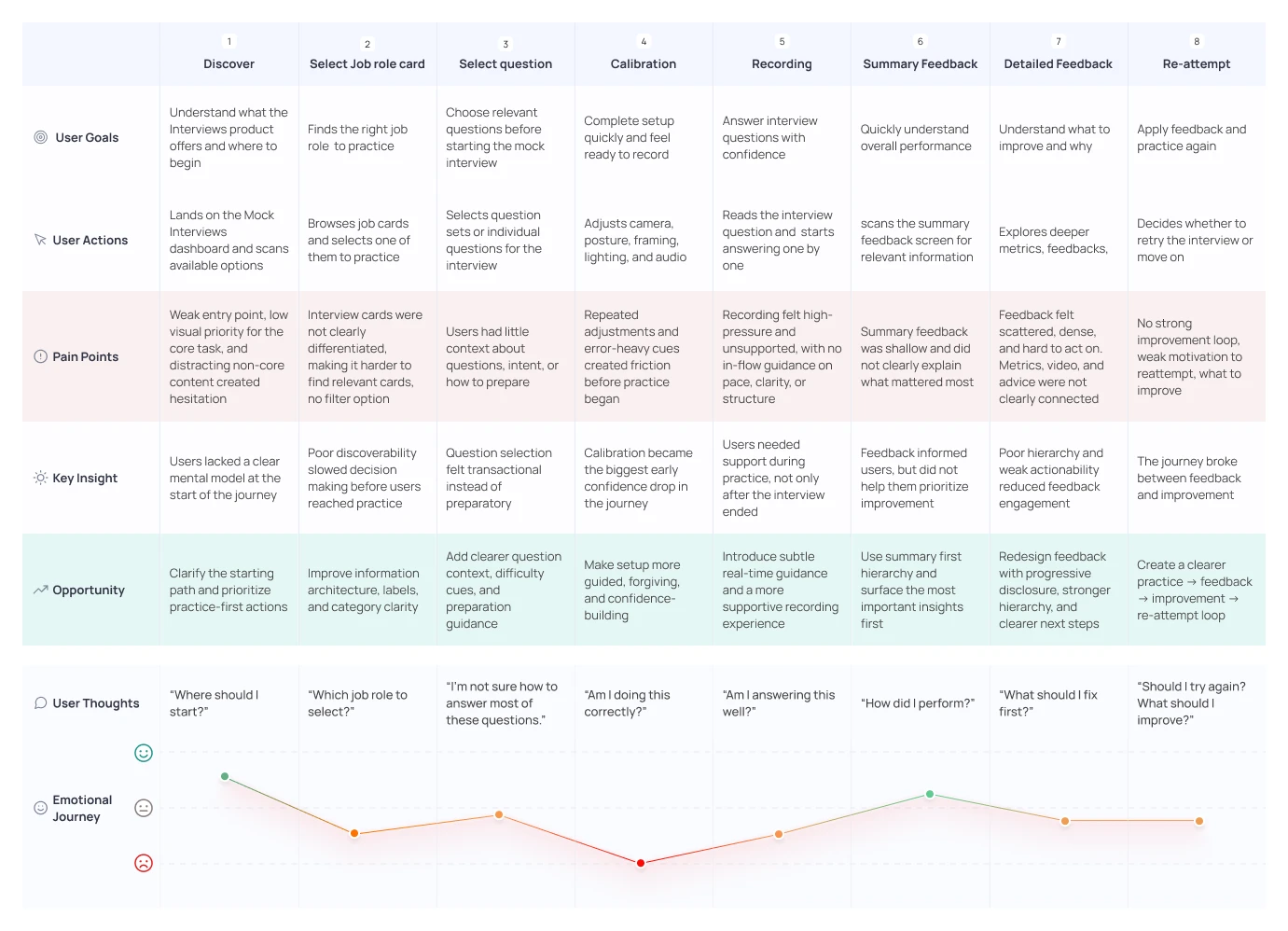
Key Takeaway
Users lost momentum across key steps
The journey map showed friction during calibration, recording, feedback review, and reattempt.
The redesign needed a more guided interview preparation flow
The focus shifted from fixing individual screens to creating a more guided interview preparation flow.
Research & Insights
Primary + Secondary Research Methods
Feedback
Clients & Users feedback
Synthesized clients and user feedback gathered through Client Success conversations, emails, surveys, and stakeholder discussions.
Data
Behavioral & Product Data Analytics
Reviewed usage patterns to understand calibration friction, feedback engagement, reattempt behavior, and how users moved across user flows
Usability Testing
Usability testing with users
Tested the existing Interviews product with users to understand task completion, calibration friction, navigation gaps, and feedback.
Heuristic
Heuristic Evaluation + Design Audit
Audited the existing experience against UX principles to identify issues in hierarchy, navigation, consistency, guidance, and cognitive load.
Competitors
Competitive Analysis
Benchmarked interview preparation products to identify gaps in feedback depth, guidance, navigation, personalization, and interview coverage.
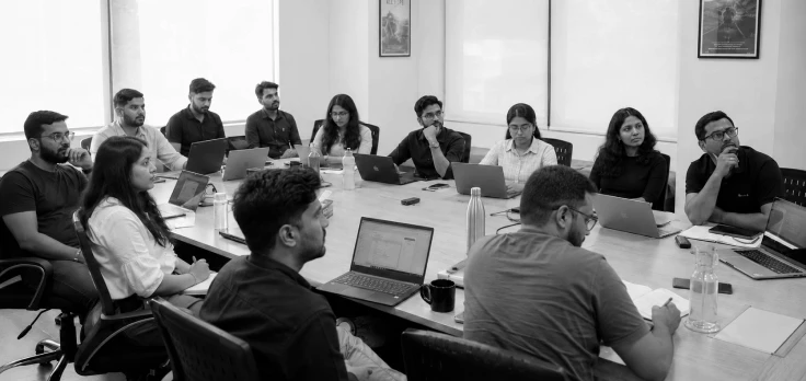
Stakeholder alignment workshop to define product scope, business goals, client needs, and redesign priorities
Understanding product gaps
I synthesized feedback from clients, users,client success team conversations, and post-session feedback.
Key Findings
Broader interview coverage was needed
Clients requested company-specific interviews, community-specific tracks, and custom assessments.
Personalization became a critical need
Clients wanted resume-based, job-description-based, and custom interview creation flows.
Users needed more guided practice
Users needed script support, guided answering help, and coach/professor-requested interviews.
Validating feedback with real usage patterns
I reviewed product usage data with the Product Manager to understand where users were losing momentum across user journey.
Key Data Insights
Calibration created early setup friction
First-attempt calibration success was around 29%, showing users struggled before reaching the core interview experience.
Feedback engagement was shallow
Many users scanned feedback for only 55 – 60 seconds, and fewer than 25% interacted with deeper improvement areas.
Reattempt behavior was low
Only around 35% of users reattempted interviews after viewing feedback.
Secondary content had low task relevance
Blogs and extra content received lower engagement than core interview actions.

I conducted moderated usability testing with 7 recent graduates and early professionals to understand how users moved from starting an interview to reviewing feedback.
Key Behavioral Findings
Calibration created early friction
Users repeatedly adjusted posture, position, and camera alignment without knowing what “correct” looked like.
Starting point was unclear
Users explored unrelated areas before finding where to begin interview practice.
Feedback was hard to act on
Users found feedback scattered and struggled to identify what mattered most.
Improvement path was weak
Users could review feedback, but were not clearly guided toward the next attempt.
Heuristic Evaluation
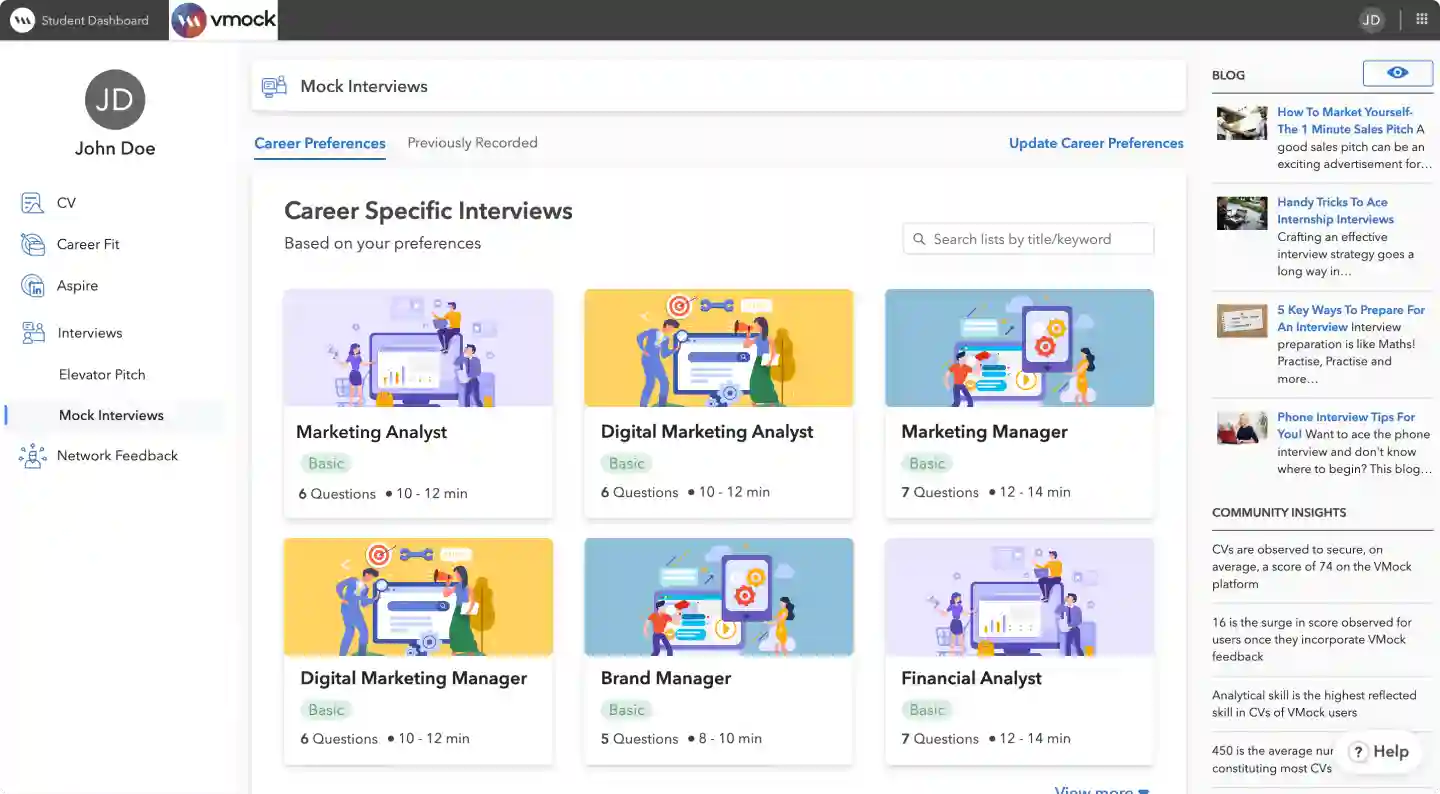
I audited the existing Interviews experience across key flows - dashboard, question selection, calibration, recording, summary feedback, and detailed feedback.
Mock Interviews Dashboard
Face Calibration Screen
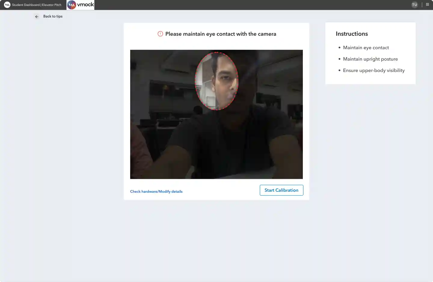
Heuristics: Visibility of System Status
(Users should always know what is happening and what to do next)
Violation:
Users could see face detection, but did not know if the setup was correct or what to fix.
Recommendation:
Add real-time setup feedback such as face aligned, move closer, or lighting low.
Severity: Very High
Recording screen

Heuristics: Visibility of System Status
(Keep users informed about what is happening in real time)
Violation:
Users received no real-time guidance on delivery, eye contact, pacing, or response quality.
Recommendation:
Add live performance cues to help users adjust while answering.
Severity: Very High
Takeaways from Heuristics (20+ screens)
Remove distractions from key tasks
Remove distracting content so users can focus on starting, recording, and improving interviews.
Show real-time guidance during critical moments
Provide live cues during calibration and recording to reduce guesswork and uncertainty.
Make setup instructions easier to follow
Use simple instructions and clear system states during camera, posture, and calibration flows.
Use hierarchy to make decisions faster
Highlight primary actions and key information so users can make decisions faster.
Competitor Research
What other interview products were missing
I reviewed Big Interview, Huru.ai, Exponent, and 15+ other products to understand how they support interview practice, feedback, and improvement.
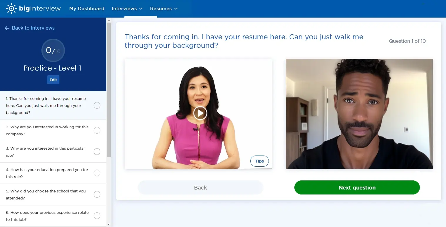
Big Interview
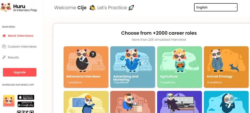
Huru.ai
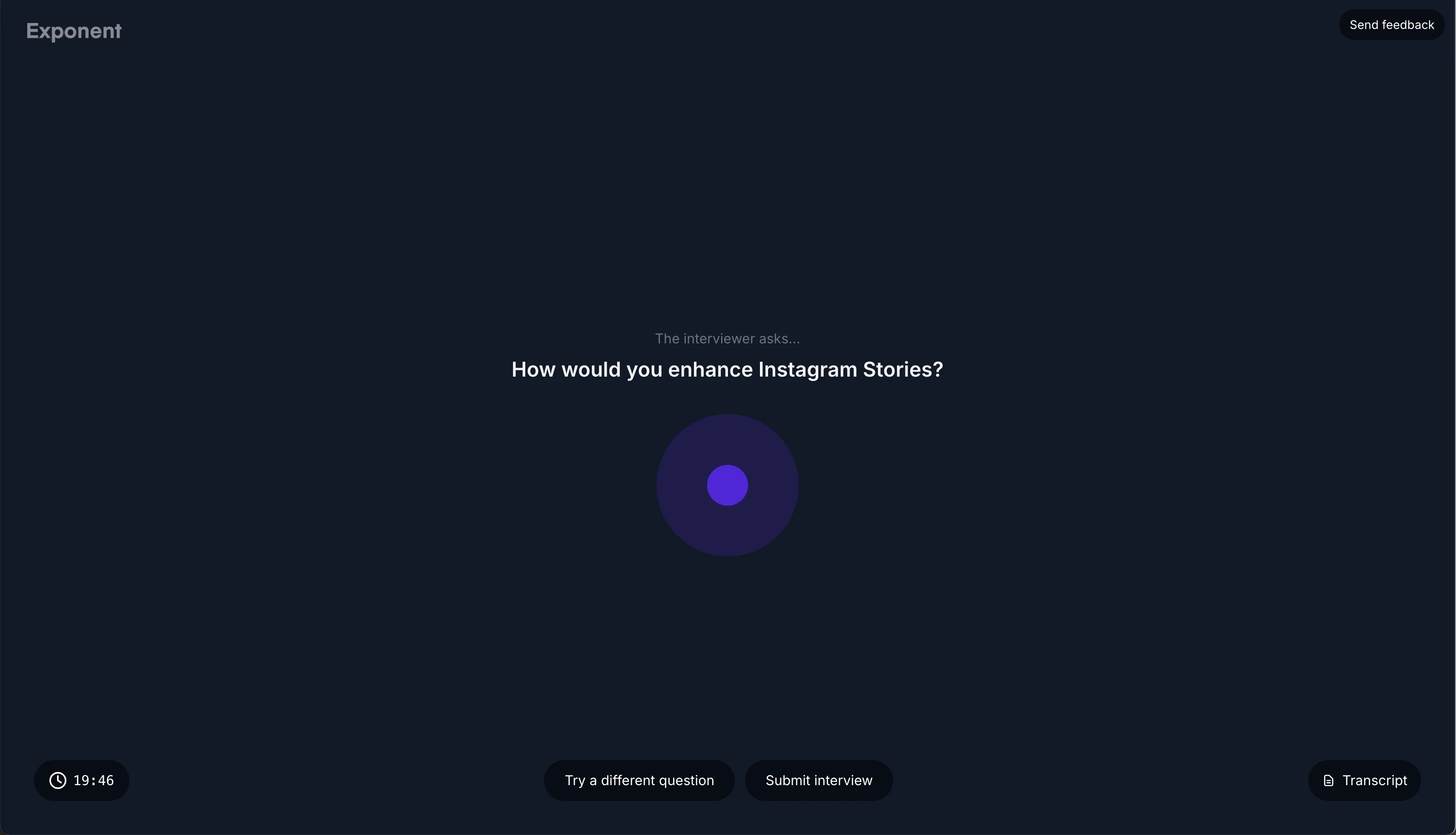
Exponent
Overall Key Insights
Personalized interview practice was limited
Most products supported general practice, but lacked resume, JD, company, or community-based preparation.
Users could not request interviews from coaches
Most products did not let users request interview questions from coaches or university experts.
Feedback was not easy to act on
Most products showed scores or gaps, but did not clearly explain what users should improve next.
Re-attempt interview was not simple
Only few products helped users review feedback, watch answers, and practice again in one place.
Users did not know where to start
Users struggled to find the right interview type for their goal.
Opportunity: Make interview options easier to find and choose.
Users were not prepared before recording
Users selected questions and started recording without enough help.
Opportunity: Add role context, scripts, guides, and answer support.
Calibration was confusing
Users faced setup issues before reaching the actual interview.
Opportunity: Make calibration clearer and easier to complete.
Feedback was hard to act on
Users received feedback but did not know what to improve first.
Opportunity: Make feedback simpler, clearer, and more useful.
Users were not practicing again
Users were not moving from feedback back into another attempt.
Opportunity: Make it easier to review feedback and practice again.
The product needed more interview types
Clients needed more personalized and community-specific interview options.
Opportunity: Add more interview types without making the product confusing.
What the New Experience Needed to Solve
Personalize the journey
Support role-based, company-specific, generated, custom, requested, and community-led practice.
Reduce setup friction
Make calibration easier with clearer instructions, cues, and feedback.
Make recording feel guided
Support users with real-time cues and previous improvement focus areas.
Improve interview discoverability
Help users quickly find the right interview type across multiple flows.
Convert feedback into action
Suggest specific improvements and next steps.
Redesign feedback hierarchy
Show top insights first, then allow deeper analysis.
Core Interview Practice Flow
I created one simple interview loop that connects selection, preparation, practice, feedback, and re-attempt across different interview types.
One reusable interview loop
Design Decisions
Select interview type
Added more interview types and clearer entry points
Choose relevant questions
Added AI scripts and prep guides before practice
Setup screen - Face calibration
Added live feedback to reduce setup confusion
Record - Interview practice screen
Added live guidance, scripts, and past-attempt tips.
Review feedback
Made feedback clearer with improvements and next steps.
Re-attempt
Made it easier to practice again from multiple access points.

Design Exploration
Quickly testing structure before high-fidelity design
I used quick sketches to explore layout, hierarchy, and guidance patterns before moving into digital design.
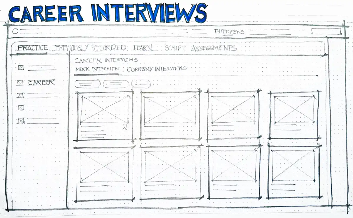
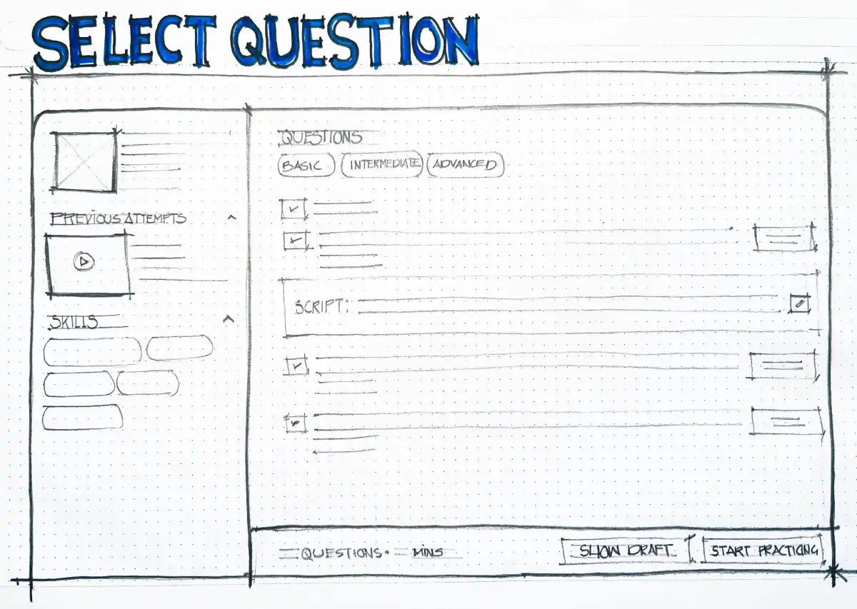
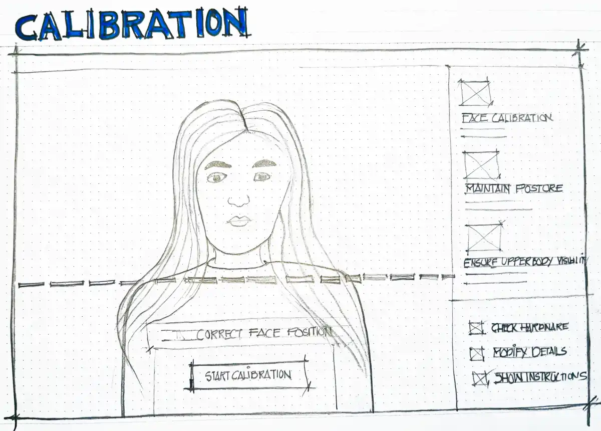
Explored how face positioning, posture, instructions, and hardware checks could make setup less confusing.

Explored how video, questions, scripts, and real-time guidance could support users during practice.
Key Takeaways
Early sketches helped validate the journey structure before moving into detailed wireframes and final UI.
Mock Interviews
(Before)
UI/UX Issues
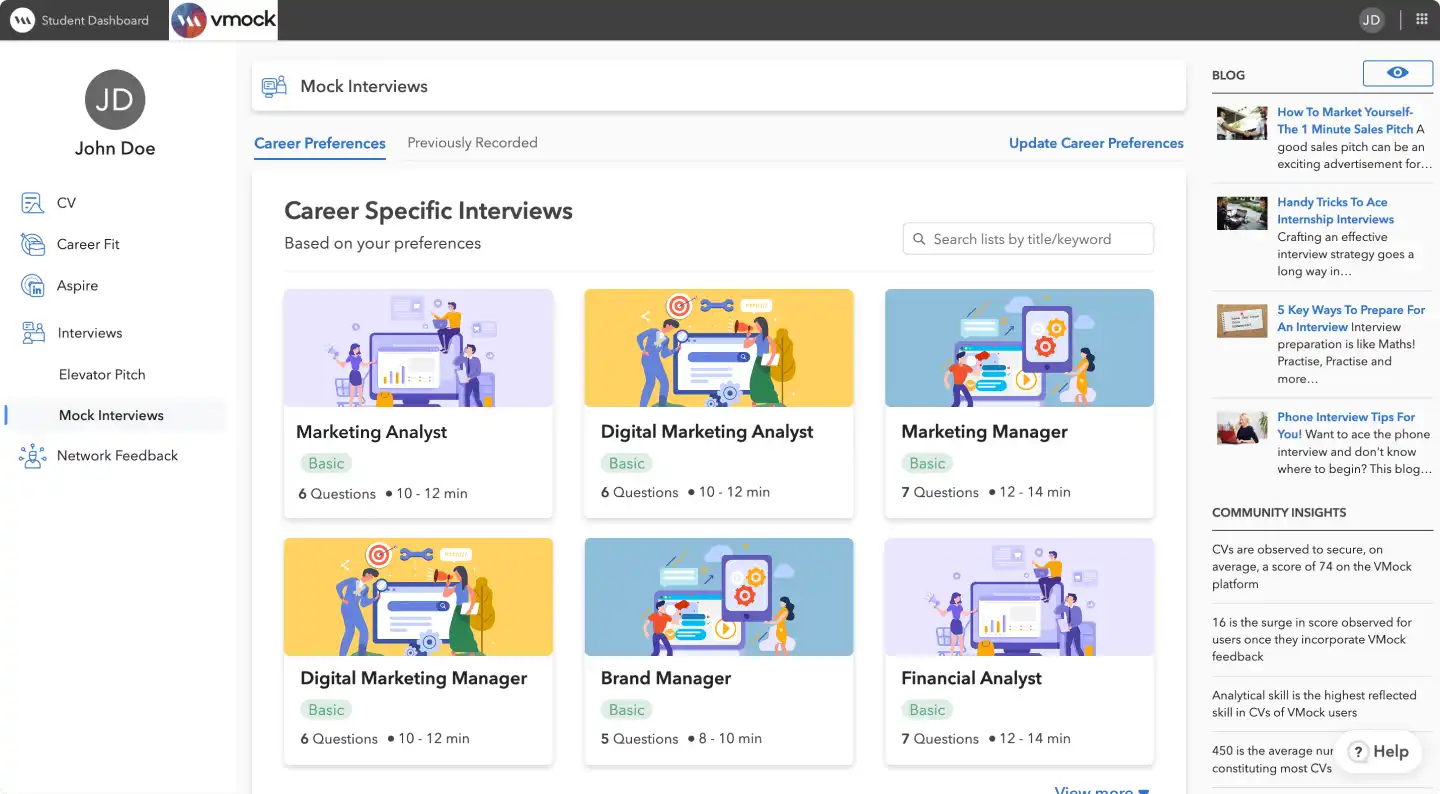
Repeated card visuals made roles look similar
Similar card visuals made the dashboard harder to scan.Right-side content distracted users
Blogs and community insights pulled attention away from starting interview practice.
Missing filters made interview discovery slower
Users had to scan too many roles without clear filters or grouping.
Mock Interviews
(After)
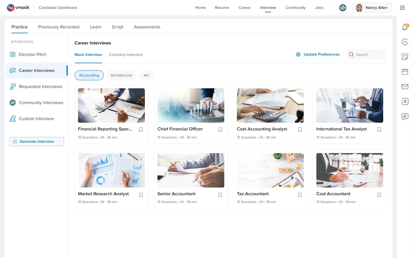
Design Decisions
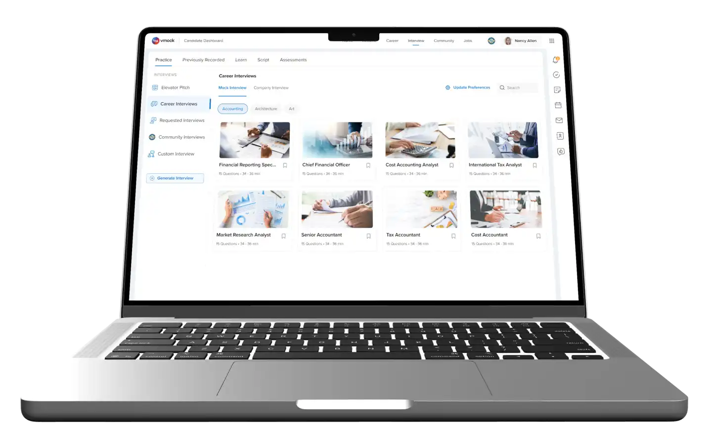
Created one clear Practice section
I moved Practice, Previously Recorded, Learn, Script, and Assessments into clear top-level tabs.
Made interview cards easier to scan
I replaced repeated graphics with more relevant images and cleaner card details.
Moved distracting content out of the dashboard
I moved blogs and community insights into Learn, so users could focus on starting practice.
Added clearer filters and grouping
I added category filters so users could quickly find the right interview without scanning too much.
Company Interviews
(New Addition)
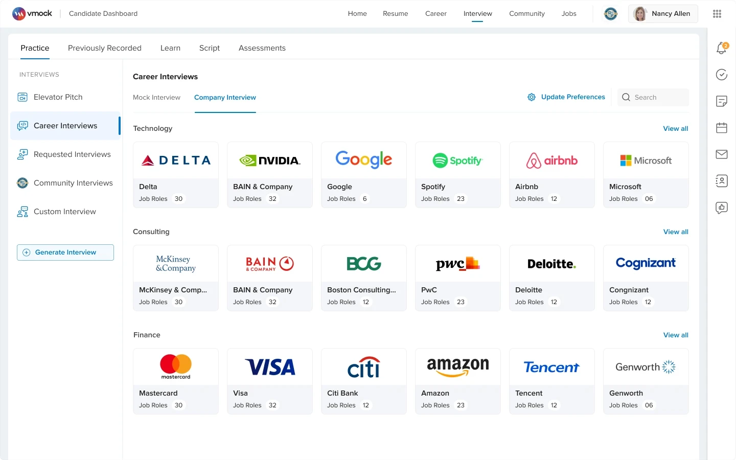
Design Decisions
Added company-specific interview practice
I added Company Interviews so users could prepare for interviews based on specific companies and job roles.
Select Question
(Before)
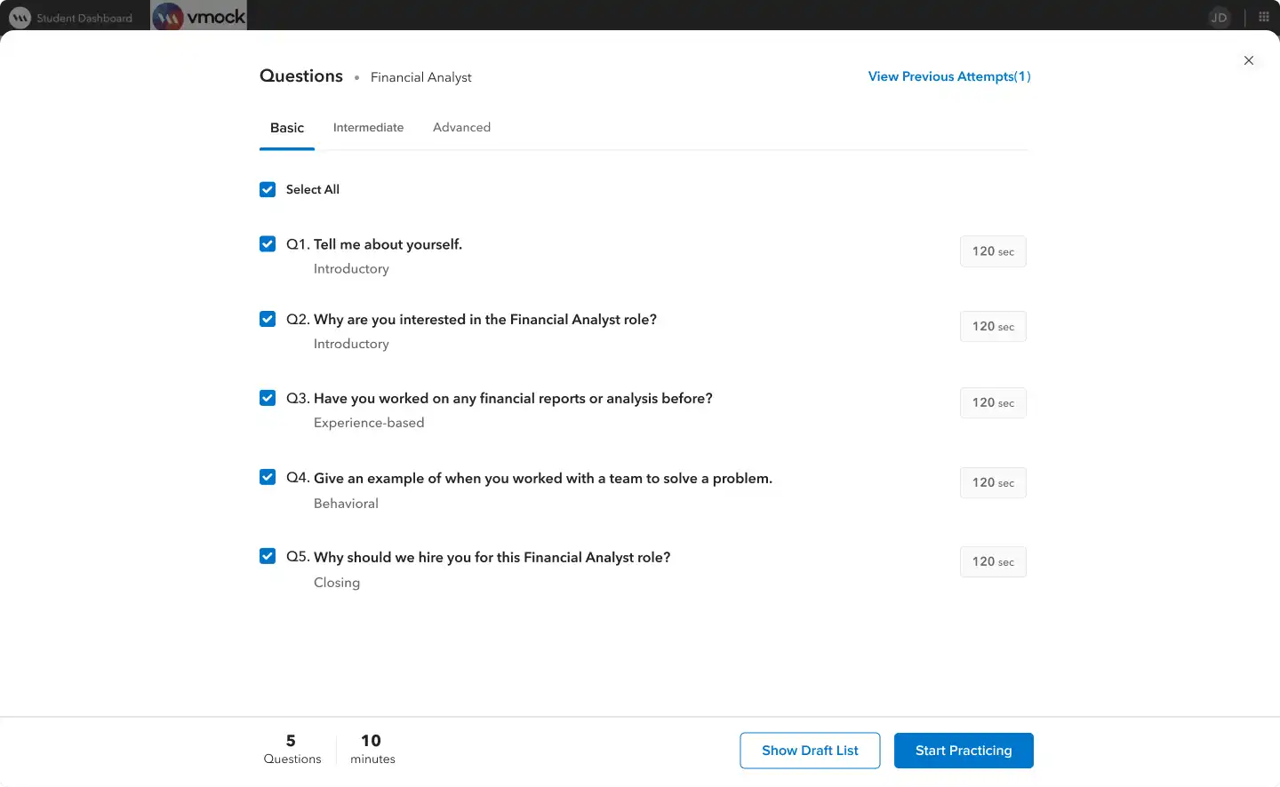
UI/UX Issues
Users had no role context
Users selected questions without knowing what the role needed or how to answer better.
Previous attempts were hard to use
Past attempts were only shown as a link, so users could not easily learn from them.No script support before practice
Users moved directly from question selection to recording without enough preparation.
Select Question
(After)
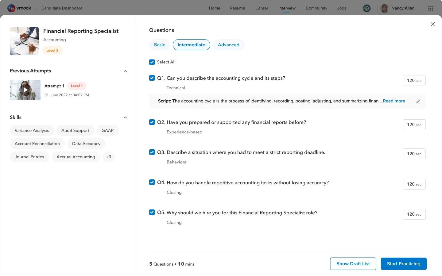
Design Decisions
Added role and skill context
I added a side panel with role details, skills, level, and previous attempts.
Made past attempts easier to access
I showed previous attempts on the screen so users can access & learn from past practice.
Added AI script support before practice
Users could generate and edit scripts before recording their answers.
Face Calibration Screen
(Before)
UI/UX Issues
No live feedback during setup
The screen did not show in real time if the face, lighting, or posture was correct.
Instructions were easy to ignore
Instructions were only text-based and placed away from the camera area, making them less noticeable during setup.
Face Calibration Screen
(After)
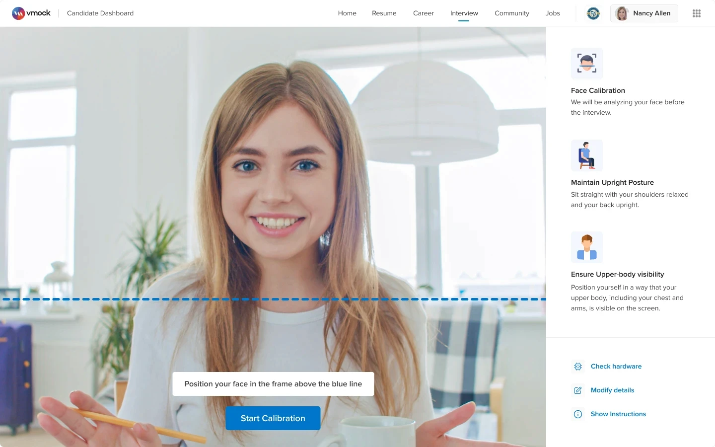
Design Decisions
Made face alignment easier
I replaced strict face alignment with a simpler guide so users could position themselves naturally.
Added live setup feedback
The screen now shows if the face, posture, and visibility are correct in real time.
Made setup help easier to notice
I added clear visual instructions and support options like Check hardware and Show instructions.
🚀 Overall Impact
First-attempt calibration success improved from 29% to 85%.
Pre-Calibration Layer
(New Addition)
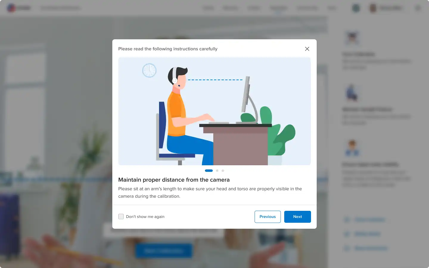
Design Decisions
Added setup guidance before calibration
I added a short pre-calibration layer with visual instructions so users could understand posture, distance, and camera framing before starting.
Recording Screen
(Before)
UI/UX Issues
No live help during recording
Users did not get real-time guidance or past-attempt tips while answering.
Users could not pause during practice
Users had to continue under pressure or restart the full session.
Recording Screen
(After)
Final Design
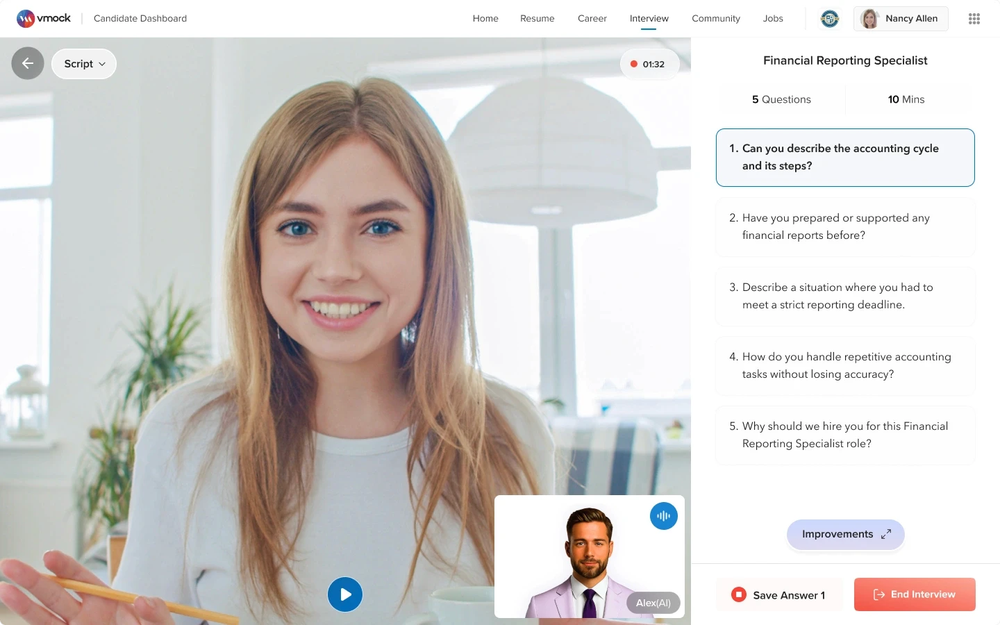
Design Decisions
Made the screen feel cleaner, immersive
I redesigned the layout so the video, questions, and controls were easier to focus on.
Added pause and resume button
Users could pause interview during practice to think, prepare or read content
Final Design: Script open state
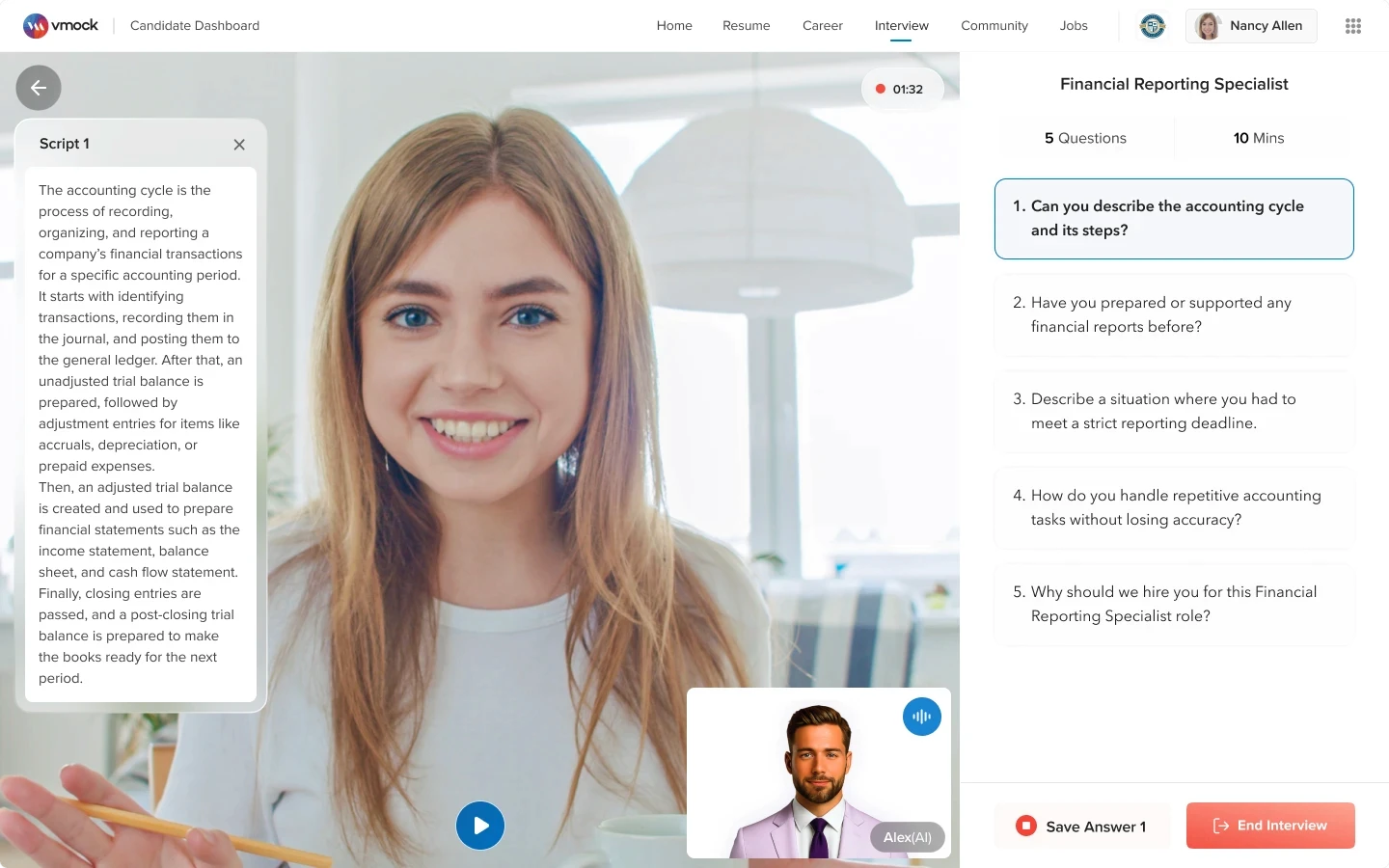
Design Decisions
Added answer scripts
Users could open scripts during practice to prepare answers.
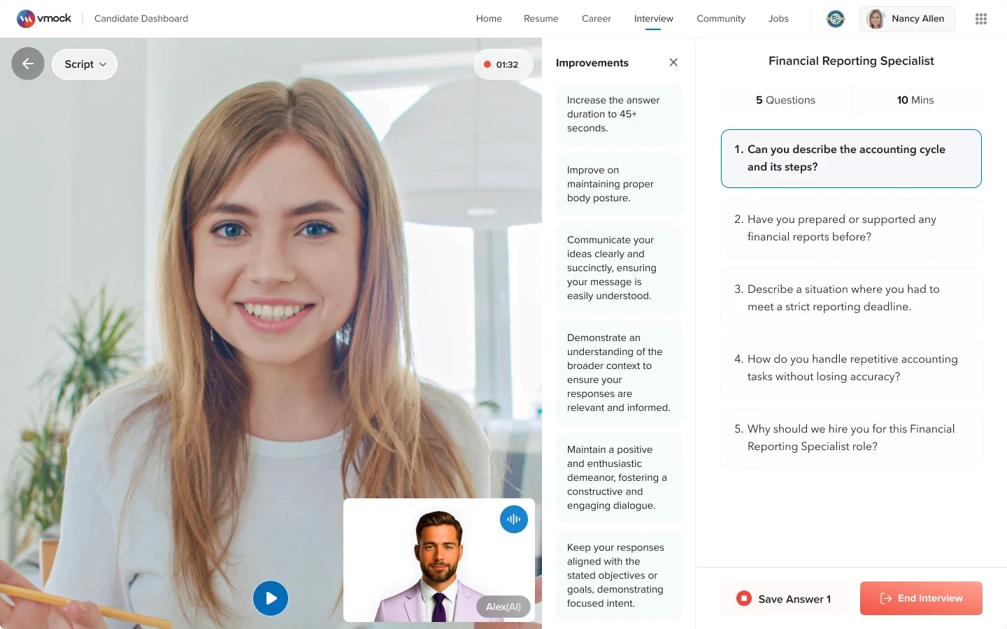
Improvement Steps Container - Iteration 1
Design Decisions
Added past-attempt improvement tips
Users could see what to improve from their previous attempt while recording.
Improvement Steps Container - Iteration 2

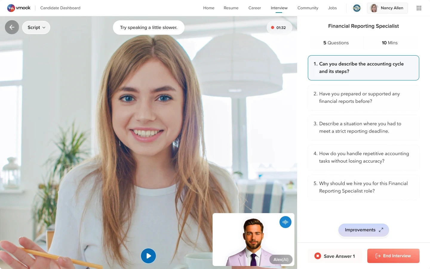
Real-time guidance banner screen
Design Decisions
Added live feedback, guidance
Users received real-time tips on pacing, eye contact, and response quality.
Summary Feedback Screen
(Before)

UI/UX Issues
Summary feedback was not visible at a glance
Users had to scroll to see the full summary, instead of understanding it in one view.
Next steps were not clear
Users could see weak areas, but did not know what to improve first.Layout used space poorly
Large icons and extra spacing made the feedback feel spread out and harder to read.
Summary Feedback Screen
(After)

Design Decisions
Showed full summary in one view
Users could now understand their overall performance without scrolling
Grouped feedback into clear sections
I organized feedback into Non-Verbal, Delivery, and Content so users could scan it faster
Added clear improvement steps
I added a right-side panel to show what users should improve next
Made the layout easier to read
Cleaner cards, labels, and status tags made feedback easier to understand
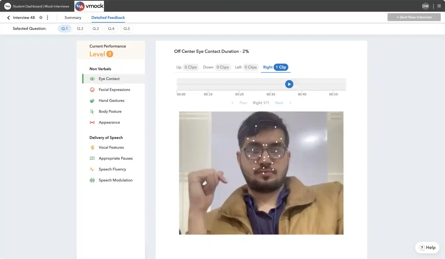
Detailed Feedback Screen
(Before)
UI/UX Issues
Insights had no clear next steps
The data was hard to understand, and users did not know what to improve next.
Status was hard to read for color-blind users
The feedback status depended mainly on color, so some users could not clearly tell which areas were good or needed work.Screen space was not used well
The layout looked empty in some areas and crowded in others, making the screen feel unbalanced.
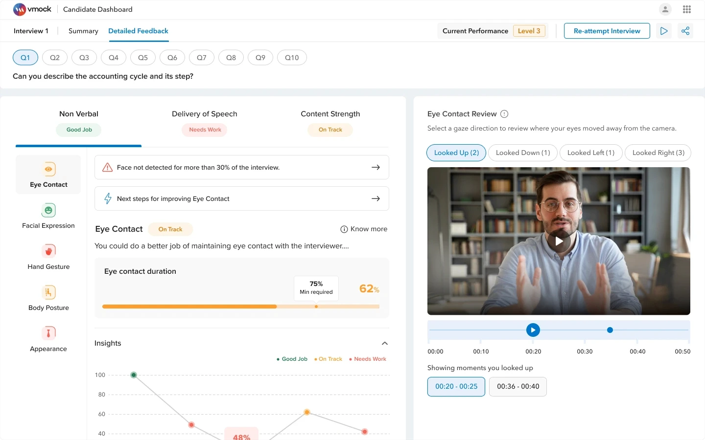
Detailed Feedback Screen
(After)
Design Decisions
Made feedback easier to explore
I grouped feedback into clear sections like Non-Verbal, Delivery, and Content.
Added clear next steps
Users could see what went wrong and what they should improve next.Connected feedback with video moments
Users could review the exact video moments where an issue happened.Added clearer status indicators for colour blind people
I used labels, icons, and progress bars so feedback was not dependent only on color.
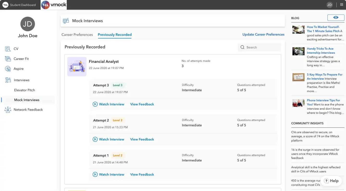
Previously Recorded
(Before)
The old Previously Recorded view kept past attempts inside each interview type, making it harder for users to review progress as the product expanded.
UI/UX Issues
Past recordings were not in one place
Users had to look inside each interview type to find old attempts.
Performance preview was missing
Users had to open feedback separately to understand how they performed.
Right-side content distracted users
Blogs and community insights pulled attention away from reviewing past interviews.
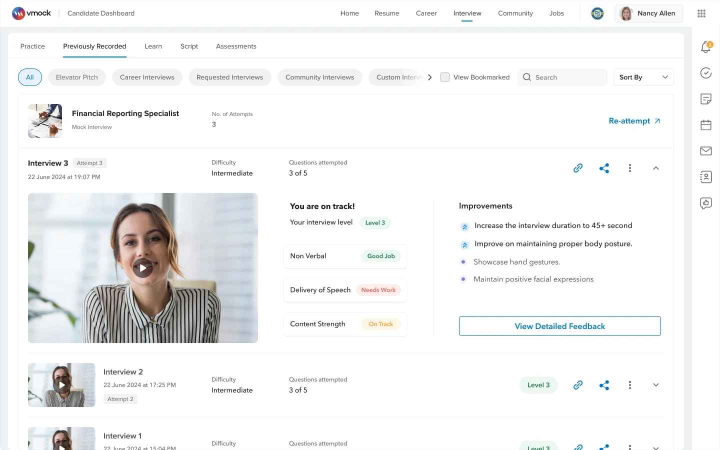
Previously Recorded
(After)
The Previously Recorded screen provides a centralized view of past interviews, enabling users to quickly revisit, reflect on performance, and continue improving.
Design Decisions
Kept all past interviews in one place
Users could quickly find recordings from different interview types.
Added performance preview
Users could see level, feedback, and improvements before opening detailed feedback.
Made re-attempt easier
Users could start another attempt directly from the past recording.

Bringing Human Guided Practice into the Product
Added interview requests from coaches
Users could request personalized interview questions from coaches, professors, or experts.Made the request option easy to understand
The page clearly explains the feature and gives users one clear action: Request Interview.Showed suggested experts
Users could see relevant coaches and experts before sending a request.
Request Interview
(Requested Interview Flow)

Design Decisions
Added suggested coaches
Users could choose from a list of relevant coaches or experts.Kept the request form simple
Users could add basic details like function, career track, interviewer name, and email.
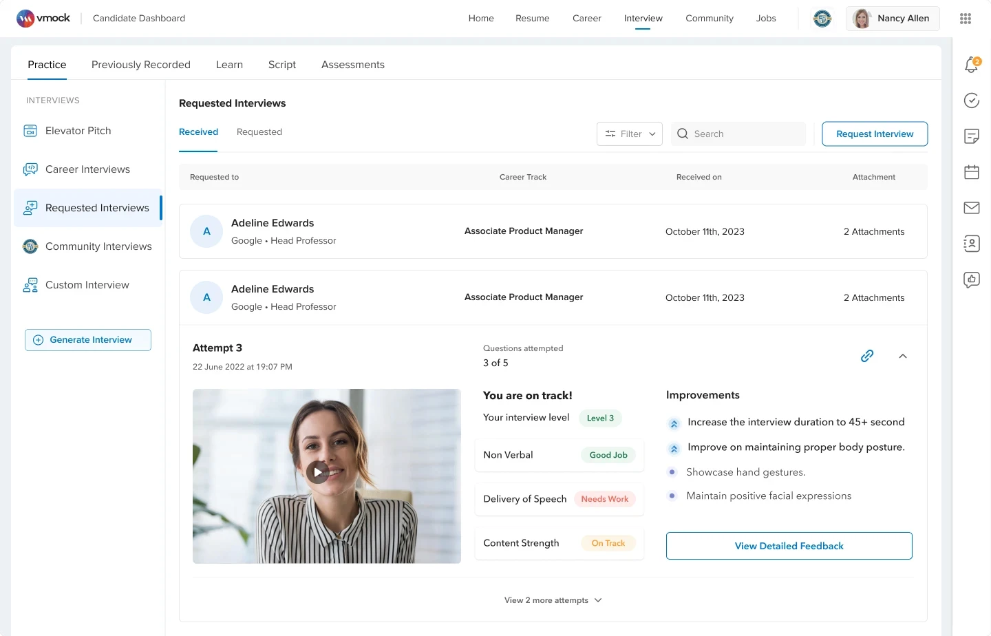
Received Interviews
(Requested Interview Flow)
Design Decisions
Kept received interviews in one place
Users could see all interviews received from coaches in one clear list.
Added quick interview details
Users could see who sent the interview, role, date, and attachments.
Connected practice with feedback
Users could review their video, level, feedback, and improvements on the same screen.
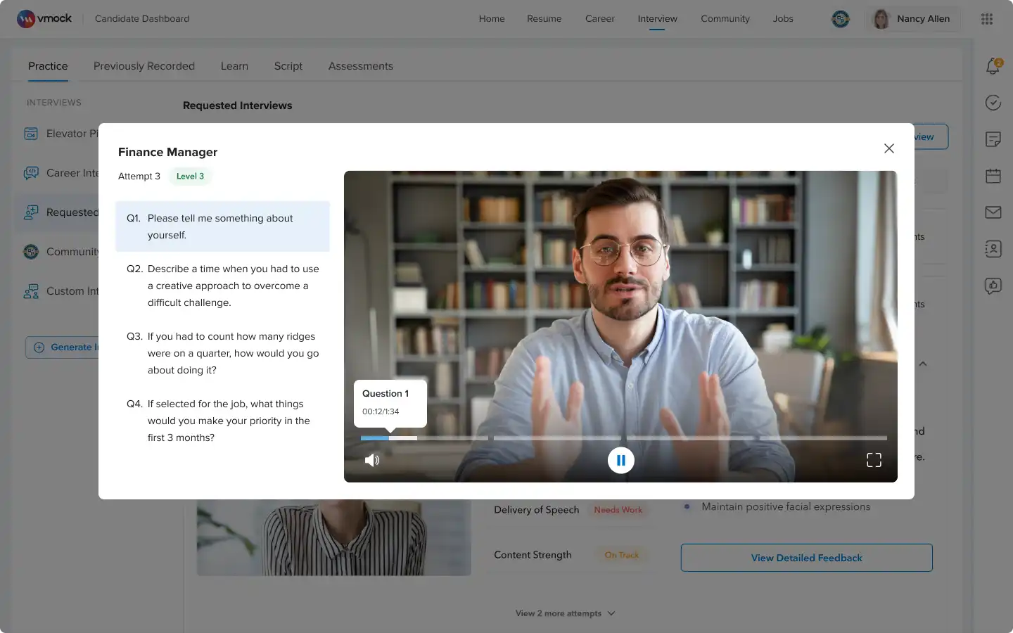
Interview video recording
(Requested Interview Flow)
Design Decisions
Made video review easier by question
Users could select a question and the video would jump to that answer, instead of replaying the full interview.
Custom Interview
(New Addition)
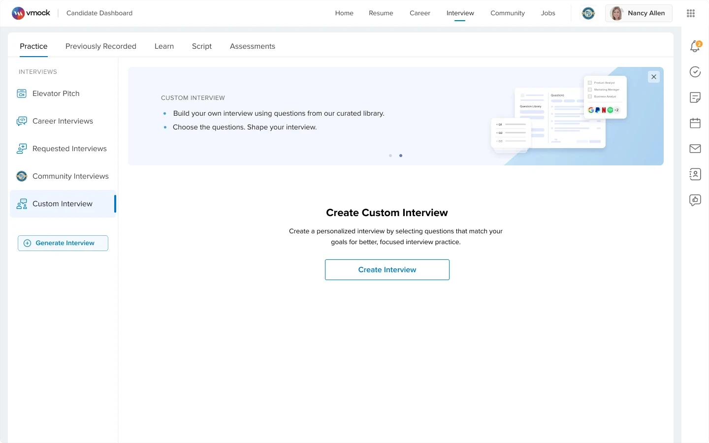
Custom Interviews let users create their own practice sessions by choosing questions that match their goals.
Design Decisions
Added user-created interviews
Users could create their own interview instead of only using predefined sets.
Made practice more personal
Users could choose questions based on their role, goal, or weak areas.
Kept the entry point simple
The screen focused on one clear action: Create Interview.
Question Library
(Custom Interview Flow)

Design Decisions
Organized questions into clear groups
Users could browse questions by category and subcategory.
Made question selection easy
Users could quickly select multiple questions using checkboxes.
Added flexibility before creating interview
Users could add questions, generate scripts, and review selected questions before creating the interview.
Custom Interview dashboard
(Custom Interview Flow)

Design Decisions
Made created interviews easy to find
Users could see all their custom interviews as simple cards.
Made practice quick to start
Users could start practicing directly from the interview card.
Added search and create options
Users could quickly find an old interview or create a new one.
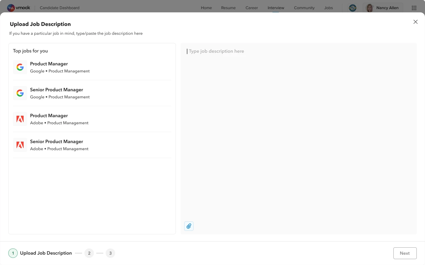
Generated Interview Flow - Upload Job Description(Step 1)
Design Decisions
Made job-specific practice possible
Users could create interview questions from a job description and resume.
Made starting easier
Users could paste a job description, upload one, or choose from recommended jobs.
Added step-by-step progress
Users could clearly see where they were and what came next.
Generated Interview Flow - Selecte Resume(Step 2)

Design Decisions
Made resume selection easier
Users could choose from previously uploaded resumes
Added preview and upload option
Users could check the resume or upload a new one without leaving the flow.
Generated Interview Questions
(Generate Interview Flow)

Design Decisions
Showed the job and resume context
Users could see the job description, selected resume, and key skills used to create the questions.
Gave users control over questions
Users could add, replace, or edit questions before starting practice.
Made it easy to start practice
Users could review the final question list and start practicing with one clear action.
Assessments
(New Addition)
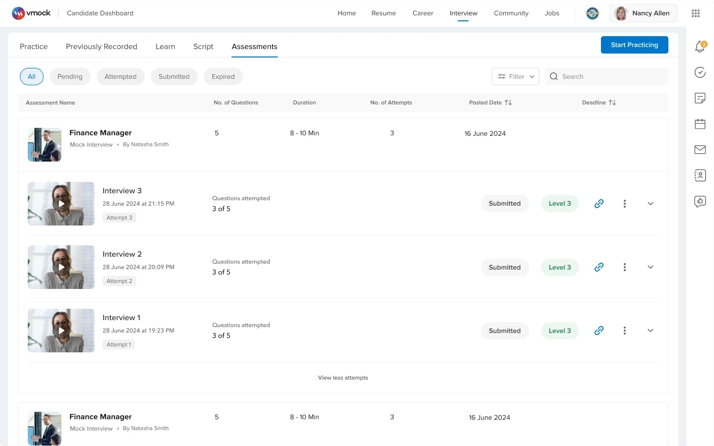
The Assessments page provides a centralized view of all evaluation tasks, helping users track status, review attempts, and take clear next actions.
Design Decisions
Kept all assessments in one place
Users could see pending, attempted, submitted, and expired assessments in one dashboard.
Made assessment status easy to track
Users could quickly understand what was completed and what needed action.
Reused familiar review patterns
Users could review attempts, feedback, and improvement details in a familiar format.
Design System
VMock Design System
A cohesive design language built on semantic tokens to support consistency, accessibility, and smoother implementation across UI components.

WCAG 2.1 Compliance
Contrast ratios, focus states, keyboard navigation

Screen Reader Support
Optimized ARIA labels and semantic HTML

Typography Hierarchy
Clear reading paths with consistent hierarchy

Motion & Animation
Respects reduced motion preferences

65+
New business schools adopted
4.5
CSAT Score
+74%
Engagement with detailed feedback
29% → 85%
First Attempt Calibration success
90%
increase in re-attempt behavior.
Final Design Takeaway
The final design turned VMock Interviews from a basic mock interview flow into a guided, personalized, and scalable interview preparation platform.
Core journey became clearer
Users could move from practice to feedback and re-attempt more easily.
Practice became more personalized
Users could practice through generated, custom, requested, company, community, and assessment flows.
Platform became easier to scale
Reusable patterns helped support multiple interview types without making the product confusing.
Key Learnings
Guidance matters before performance
Users need clarity before calibration, question selection, and recording.
Feedback must show what to improve
Scores are not enough; users need clear next steps.
Personalization makes practice more useful
Role-based, JD-based, company, and requested flows made practice more relevant.
Consistency helps the product scale
Reusable cards, tabs, filters, and feedback patterns kept the product easy to use.
Next Steps
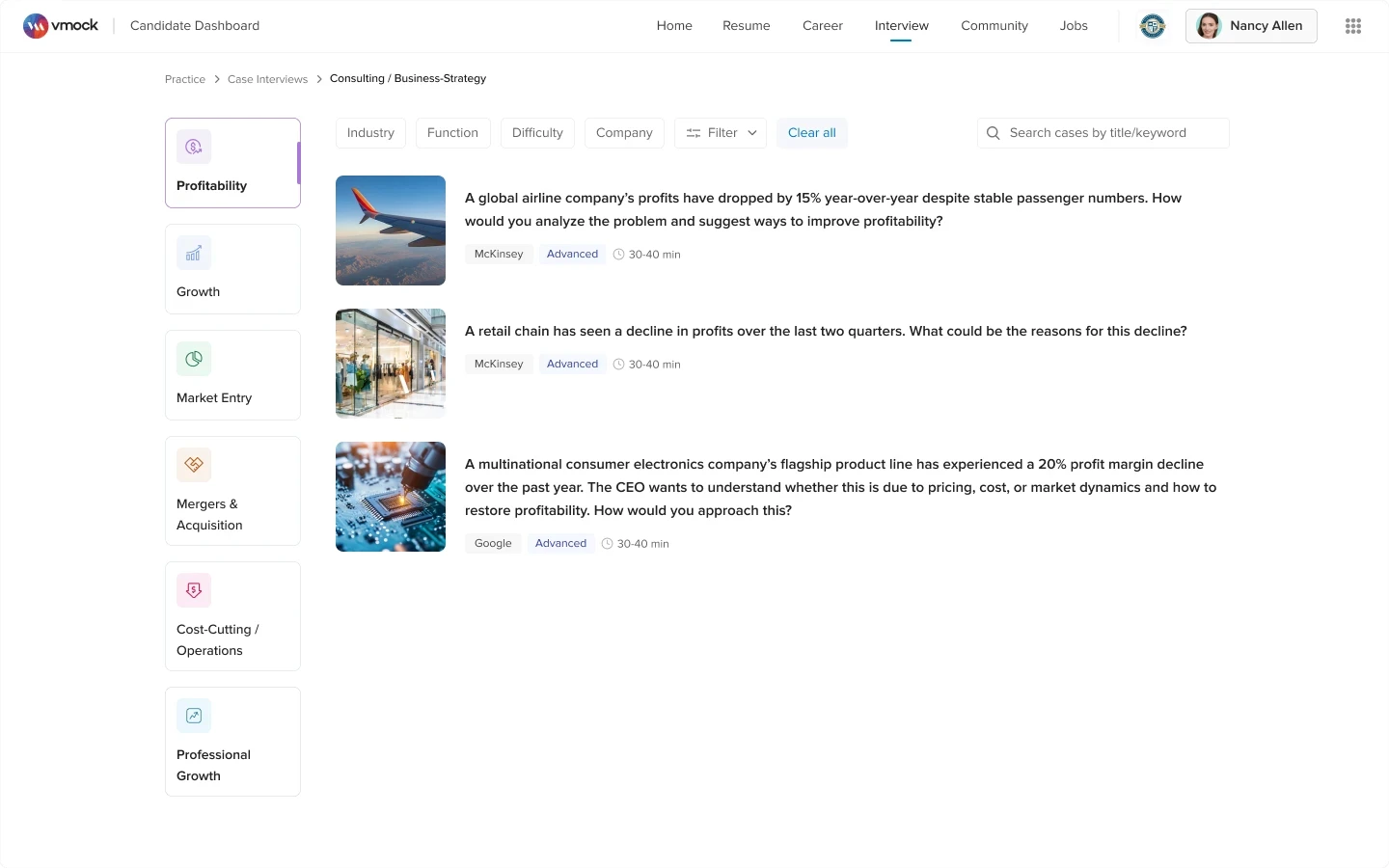
Case Interviews
Explore structured case interview practice for consulting-focused users.
Live Adaptive AI Interviews
Enable AI-led interviews with follow-up questions based on user responses.
Long-term Progress Tracking
Show readiness, skill trends, and attempt comparisons over time.

Final Reflection
This project reinforced that AI-driven feedback becomes valuable only when users can clearly understand it, trust it, and act on it.